
이번에는 tailwind을 이용한 플렉스, 그리드를 조절하는 방법에 대해서 소개하고자 한다.
목차
1.플렉스
1.1.justify와 items
2.그리드
플렉스
tailwind에서 flex는 하나의 공간을 의미하며, 공간의 크기를 조절하기 위해서 사용 한다. 일반적인 flex는 가로로 아이템이 쌓이며 flex-col을 통해 세로로 아이템들을 세울 수 있다. 만약 아이템이 flex박스를 넘어갈 때, 줄바꿈이 되길 원한다면 flex flex-wrap 클래스를 사용하면 된다.
항상 flex를 사용하다 보면, items와 justify에 대해서도 같이 나오는데 이에 대해서 알아본다.
justify와 items
간단하게 설명하면 justfiy와 items는 정렬을 하기 위한 클래스이다. 아이템들을 위, 아래로 정렬하기 위해서는 items, 좌, 우로 정렬하기 위해서는 justify을 사용한다고 이해하면 쉽다.
justify는 주로 아래와 같이 사용된다.
- justify-start
- justify-center
- justify-end
- justify-between
items는 다음과 같이 사용된다.
- items-start
- items-center
- items-end


- index.html
<!DOCTYPE html>
<html lang="en">
<head>
<meta charset="UTF-8" />
<meta http-equiv="X-UA-Compatible" content="IE=edge" />
<meta name="viewport" content="width=device-width, initial-scale=1.0" />
<script src="https://cdn.tailwindcss.com"></script>
<title>Flex</title>
</head>
<body>
<!-- Flex and alignment -->
<div
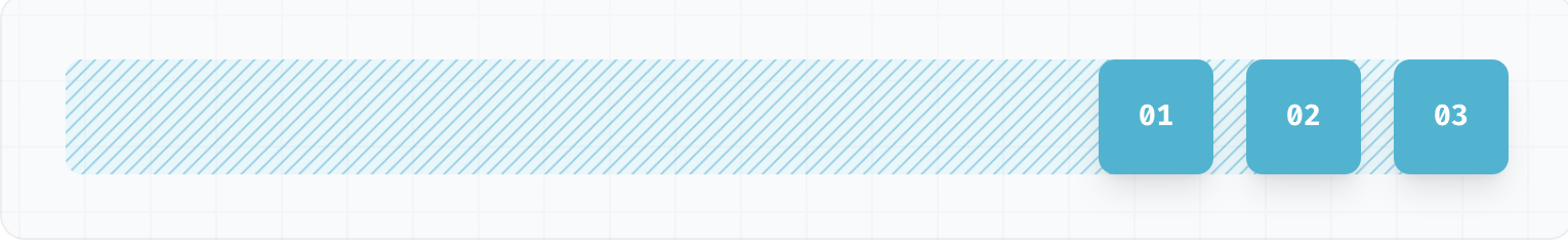
class="flex flex-wrap h-72 w-100 bg-gray-100 justify-around items-center"
>
<div class="p-10 border border-blue-600 bg-blue-100">01</div>
<div class="p-10 border border-blue-600 bg-blue-100">02</div>
<div class="self-start p-10 border border-blue-600 bg-blue-100">03</div>
<div class="self-end p-10 border border-blue-600 bg-blue-100">04</div>
</div>
<!-- Flex Column, Gap and Order -->
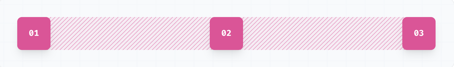
<div
class="flex flex-col gap-4 w-100 bg-gray-200 justify-around items-center"
>
<div class="order-4 p-10 border border-blue-600 bg-blue-100">01</div>
<div class="order-1 p-10 border border-blue-600 bg-blue-100">02</div>
<div class="p-10 border border-blue-600 bg-blue-100">03</div>
<div class="p-10 border border-blue-600 bg-blue-100">04</div>
</div>
<!-- Grow and shrink -->
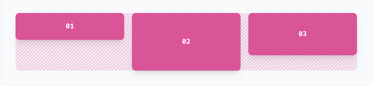
<div class="flex w-100 bg-gray-300">
<!-- flex-none: Prevent item from growing or shrinking -->
<div class="w-64 flex-none p-10 border border-blue-600 bg-blue-100">
01
</div>
<!-- flex-initial: Allow item to shrink but not grow, taking into account its initial size -->
<div class="w-64 flex-initial p-10 border border-blue-600 bg-blue-100">
02
</div>
<!-- flex-auto: Allow item to grow and shrink, taking into account its initial size -->
<div class="w-64 flex-auto p-10 border border-blue-600 bg-blue-100">
03
</div>
<!-- flex-1: Allow item to grow and shrink as needed, ignoring its initial size -->
<div class="w-64 flex-1 p-10 border border-blue-600 bg-blue-100">04</div>
<div class="p-10 border border-blue-600 bg-blue-100">05</div>
<div class="p-10 border border-blue-600 bg-blue-100">06</div>
<div class="p-10 border border-blue-600 bg-blue-100">07</div>
</div>
</body>
</html>
<!-- Justify Content
justify-start justify-content: flex-start;
justify-end justify-content: flex-end;
justify-center justify-content: center;
justify-between justify-content: space-between;
justify-around justify-content: space-around;
justify-evenly justify-content: space-evenly;
-->
<!--
items-start align-items: flex-start;
items-end align-items: flex-end;
items-center align-items: center;
items-baseline align-items: baseline;
items-stretch align-items: stretch;
-->
<!-- Flex Direction
flex-row flex-direction: row;
flex-row-reverse flex-direction: row-reverse;
flex-col flex-direction: column;
flex-col-reverse flex-direction: column-reverse;
-->
<!--
flex-wrap flex-wrap: wrap;
flex-wrap-reverse flex-wrap: wrap-reverse;
flex-nowrap flex-wrap: nowrap;
-->
<!-- Flex Properties
flex-none flex: none;
Prevent item from growing or shrinking
flex-initial flex: 0 1 auto;
Allow item to shrink but not grow, taking into account its initial size
flex-auto flex: 1 1 auto;
Allow item to grow and shrink, taking into account its initial size
flex-1 flex: 1 1 0%;
Allow item to grow and shrink as needed, ignoring its initial size
-->
그리드
그리드는 표 형식으로 아이템을 구성할때 자주 사용한다. 행과 열을 조절 할때는 grid grid-cols-3 이나 grid-rows-4을 사용하여 행과 열을 조절 할 수 있다. 만약에 그리드의 특정 영역을 다르게 설정한다면 가로는 col-span-2, 세로는 row-span-2 처럼하여 영역을 조절하여 사용 할 수 있다.
- index.html
<!DOCTYPE html>
<html lang="en">
  <head>
    <meta charset="UTF-8" />
    <meta http-equiv="X-UA-Compatible" content="IE=edge" />
    <meta name="viewport" content="width=device-width, initial-scale=1.0" />
    <script src="https://cdn.tailwindcss.com"></script>
    <title>Grid</title>
  </head>
  <body>
    <!-- Grid cols and rows -->
    <div class="grid grid-cols-3 grid-rows-4 gap-4 w-100 bg-gray-100">
      <div class="p-10 border border-blue-600 bg-blue-100">01</div>
      <div class="p-10 border border-blue-600 bg-blue-100">02</div>
      <div class="p-10 border border-blue-600 bg-blue-100">03</div>
      <div class="p-10 border border-blue-600 bg-blue-100">04</div>
      <div class="p-10 border border-blue-600 bg-blue-100">05</div>
      <div class="p-10 border border-blue-600 bg-blue-100">06</div>
      <div class="p-10 border border-blue-600 bg-blue-100">07</div>
      <div class="p-10 border border-blue-600 bg-blue-100">08</div>
      <div class="p-10 border border-blue-600 bg-blue-100">09</div>
    </div>

    <!-- Col and row span -->
    <div class="grid grid-cols-3 gap-4 w-100 bg-gray-100">
      <div
        class="col-span-2 row-span-2 p-10 border border-blue-600 bg-blue-100"
      >
        01
      </div>
      <div class="p-10 border border-blue-600 bg-blue-100">02</div>
      <div class="p-10 border border-blue-600 bg-blue-100">03</div>
      <div class="p-10 border border-blue-600 bg-blue-100">04</div>
      <div class="p-10 border border-blue-600 bg-blue-100">05</div>
      <div class="p-10 border border-blue-600 bg-blue-100">06</div>
      <div class="col-span-3 p-10 border border-blue-600 bg-blue-100">07</div>
      <div class="p-10 border border-blue-600 bg-blue-100">08</div>
      <div class="col-span-2 p-10 border border-blue-600 bg-blue-100">09</div>

    </div>
  </body>
</html>

<!--
  Grid Template Columns
  grid-cols-1	    grid-template-columns: repeat(1, minmax(0, 1fr));
  grid-cols-2	    grid-template-columns: repeat(2, minmax(0, 1fr));
  grid-cols-3	    grid-template-columns: repeat(3, minmax(0, 1fr));
  grid-cols-4	    grid-template-columns: repeat(4, minmax(0, 1fr));
  grid-cols-5	    grid-template-columns: repeat(5, minmax(0, 1fr));
  grid-cols-6	    grid-template-columns: repeat(6, minmax(0, 1fr));
  grid-cols-7	    grid-template-columns: repeat(7, minmax(0, 1fr));
  grid-cols-8	    grid-template-columns: repeat(8, minmax(0, 1fr));
  grid-cols-9	    grid-template-columns: repeat(9, minmax(0, 1fr));
  grid-cols-10	  grid-template-columns: repeat(10, minmax(0, 1fr));
  grid-cols-11	  grid-template-columns: repeat(11, minmax(0, 1fr));
  grid-cols-12	  grid-template-columns: repeat(12, minmax(0, 1fr));
  grid-cols-none	grid-template-columns: none;
 -->

<!-- Grid Template Rows
  grid-rows-1	    grid-template-rows: repeat(1, minmax(0, 1fr));
  grid-rows-2	    grid-template-rows: repeat(2, minmax(0, 1fr));
  grid-rows-3	    grid-template-rows: repeat(3, minmax(0, 1fr));
  grid-rows-4	    grid-template-rows: repeat(4, minmax(0, 1fr));
  grid-rows-5	    grid-template-rows: repeat(5, minmax(0, 1fr));
  grid-rows-6	    grid-template-rows: repeat(6, minmax(0, 1fr));
  grid-rows-none	grid-template-rows: none;
-->'FrameWork > Tailwind' 카테고리의 다른 글
| Tailwind로 Html 작성할 때 사용했던 단축키나 팁들 (0) | 2023.11.07 |
|---|---|
| 트랜스폼, 애니메이션 조절하기 (1) | 2023.11.06 |
| 테두리, 필터, 상호작용 조절하기 (0) | 2023.11.05 |
| 공간 사이즈, 레이아웃, 그림자와 그라데이션 조절하기 (0) | 2023.11.05 |
| 색 , 컨테이너와 공간, 타이포그래피 조절하기 (0) | 2023.11.05 |